
Welcome back to the Ultimate Guide to Web Design series! (First time here? Be sure to check out Part 1: Branding & Design before you tackle this post.)
In Part 2: UX/UI, we’re helping you put yourself in your visitor’s shoes to see how exactly they experience your website. If you’re unfamiliar with the acronym, here’s a quick run down for you.
What Exactly Is UX/UI?
The acronym UX/UI actually refers to two separate (but closely related) aspects of web design. UX refers to “User Experience” and UI stands for “User Interface.” So, what’s the difference—and what do they mean for web design?
Here’s a simple way to think of UX/UI from a web design perspective: UI design deals with visuals, layouts, and graphics; UX design deals with the way users interact with your website.
UX design refers to with the way your website is organized to drive users where you want them to go, and UI design deals with the way your website looks, ensuring users get consistent, engaging visual elements to match.
Source: WebTricksHome
The best web designs focus on the intersection of UX/UI design. They make your users’ journey from Point A to Point B as effortless as possible, which allows you to get users exactly what you want them to do as quickly and efficiently as possible.
Simply put, it’s designing with intention.
6 Critical Aspects of UX/UI Design for Websites
User Experience and User Interface make the users’ journey from point A to point B as effortless as possible. This is what gets the user to do what you want them to do with minimal effort. It’s designing with intention.
Trust us—the numbers prove exactly what UX/UI can do for your website.
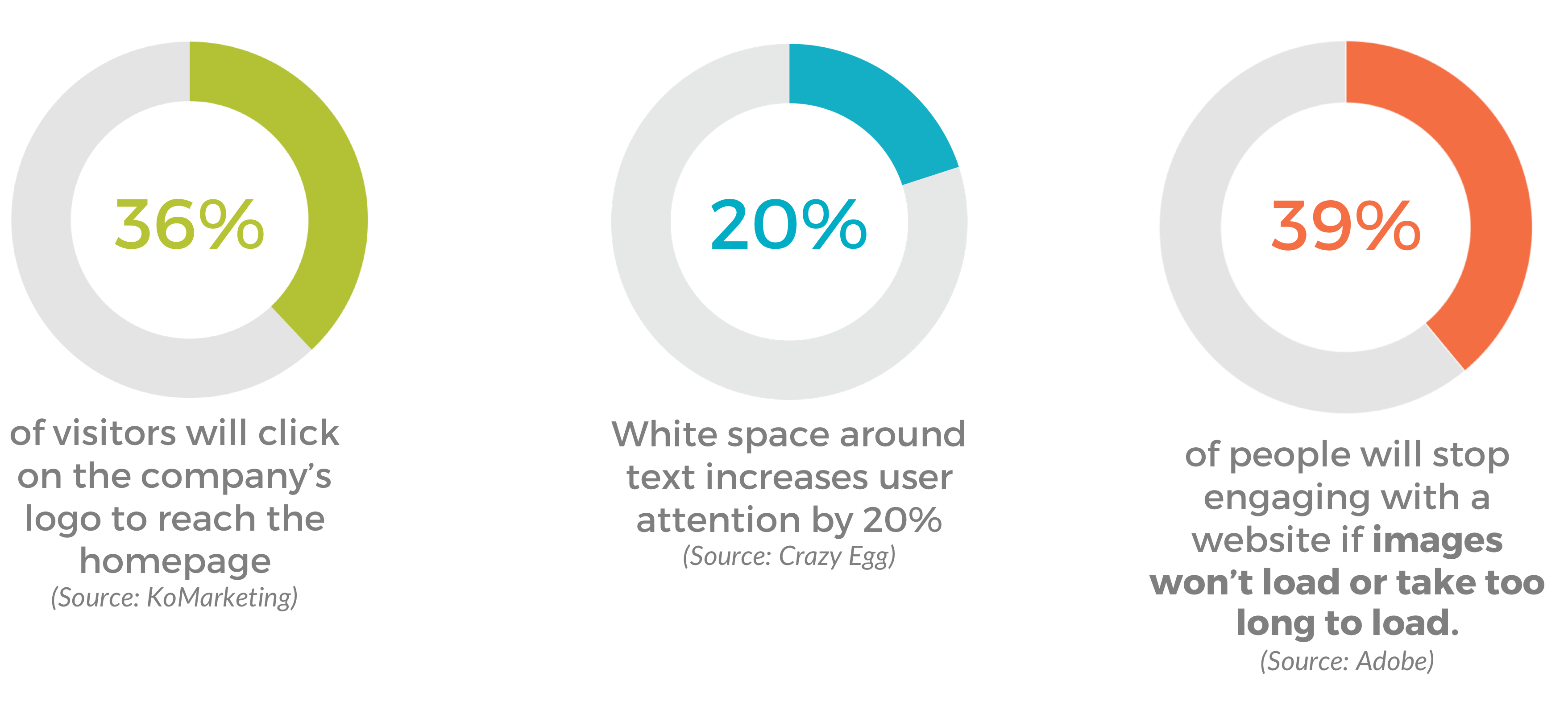
Now that you know exactly how important UX/UI is for web design, let’s dive into how you can see where your website currently stands. Here are six critical aspects of UX/UI design we bring to every website that you should check.
1. Website Layout
When we’re analyzing a client’s website for redesign, the very first thing we look at is layout.
Are they using consistent formatting across the board? It’s important to maintain the same look and feel for navigation, headers, text, typography, and hyperlinks.
Whatever you do, never make drastic design changes from one page to another. A massive switch in your design can make your user feel lost and confused and ultimately bounce. It’s important that users know they are always on your website.
2. Hyperlinks
When it comes to hyperlinks, you don’t need to reinvent the wheel. Use a contrasting color and consider underlining text—it’s that simple. We’ve all been living in the Digital Age long enough to recognize a hyperlink when we see one.
When it comes to UX/UI, hyperlinks are a critical part of designing user pathways. If they don’t recognize a hyperlink when they see one, what are the chances that they’re going to click where you want them to go?
✅ Bonus Tip: The longer the link title, the easier they are to identify.

3. Navigation
The most important aspect of UX/UI is controlling user pathways on your website. Needless to say, your navigation is a huge part of good UX/UI design.
Make sure your navigation is intuitive. If users have to go more than two levels deep in your drop-downs, you’re going to run into some serious issues. (Cue a spike in your Bounce Rate.)
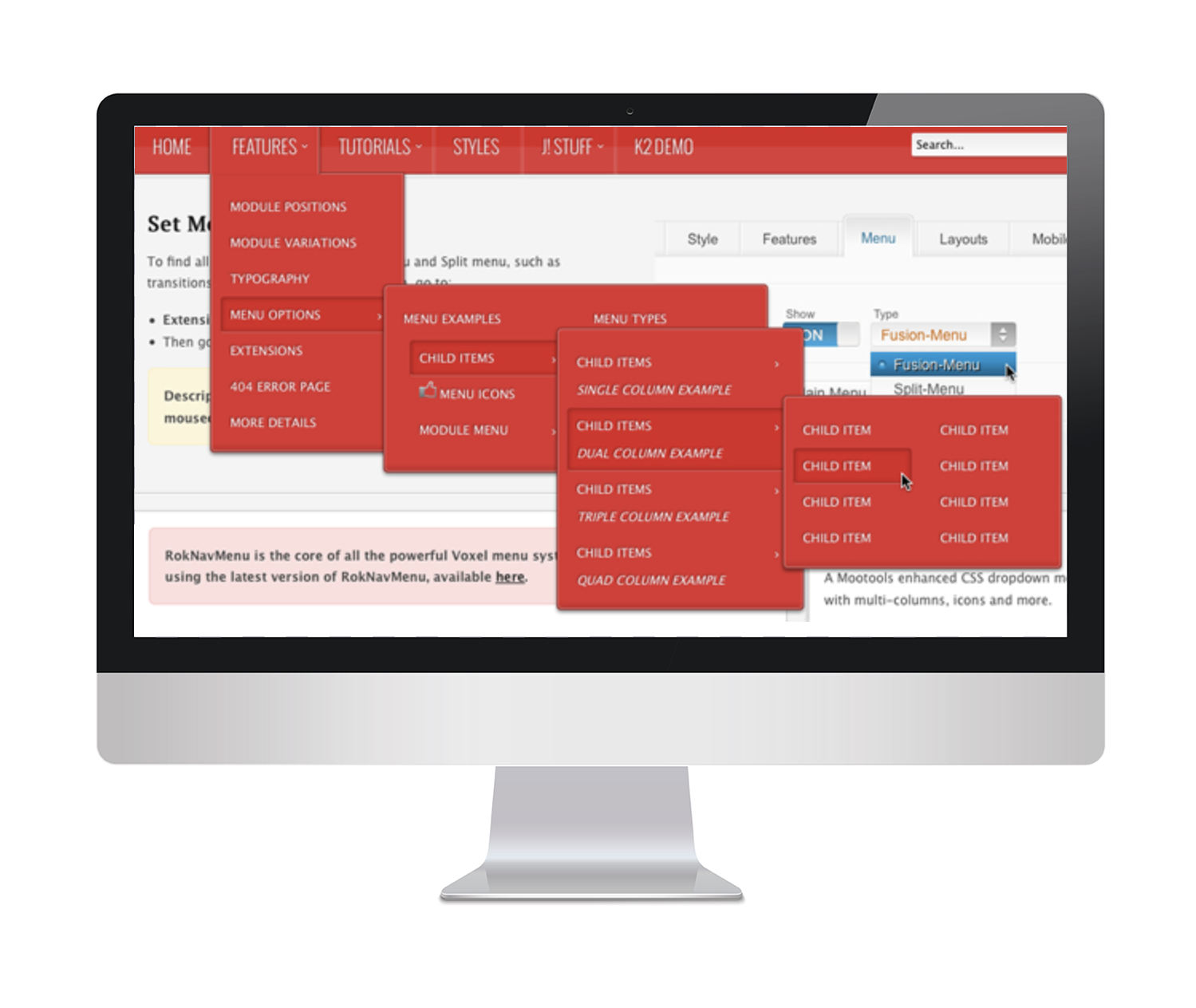
Here’s an example of what NOT to do with your navigation. Good luck finding anything on this website.
Reaching deeper pages often takes more effort than a visitor has patience for. Instead of designing deep, convoluted menus (see above), consider putting links on the side of each page that lead to related content. Once you have a clean, easy-to-use navigation layout, make sure it’s present on every page in the same location in the same order.
Here’s the main takeaway when it comes to creating better website navigation: Don’t make your user think too much. When you stray too far from accepted conventions, it can be difficult for visitors to find the information they’re looking for.
4. Whitespace
What exactly is whitespace? It’s exactly what it sounds like: empty space that allows your content to breathe. When it comes to web design in the 21st Century, simplicity is key—and whitespace is your key to keeping it simple.
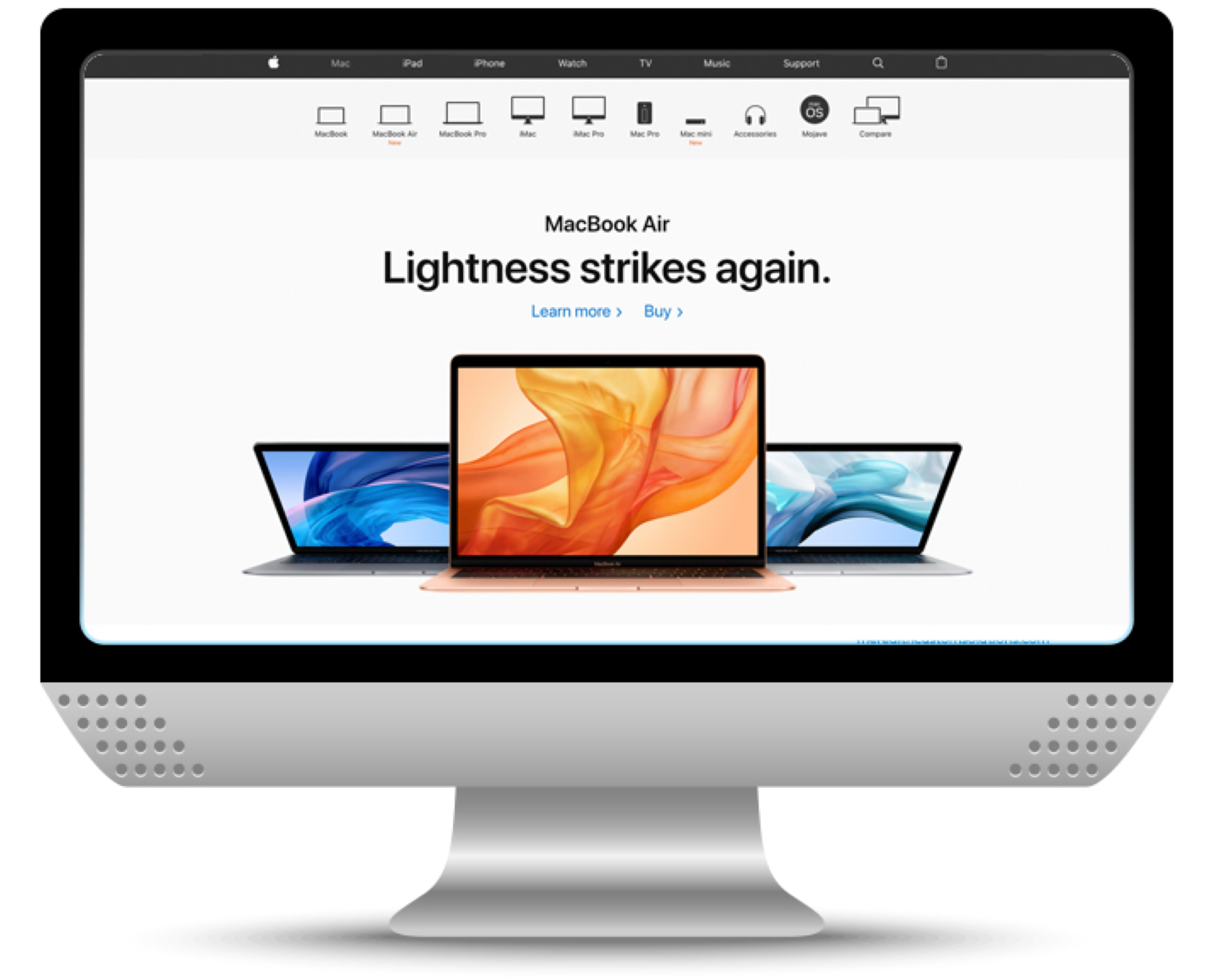
Apple’s website may be the best-known (and best-case) scenario. They use whitespace to focus attention on the products and the products alone.
Whitespace makes it easier for users to segment and digest information. It allows you to draw visitors’ eye to the most important aspects of each web pages without getting distracted.
One downside of whitespace, however, is that it does indeed take up space. That’s where the importance of content comes into play. (Stay tuned for Part 3: Content, where we’ll show you how to make sure that your key messaging gets the attention it deserves.)
Here’s the takeaway when it comes to UX/UI design: Whitespace is your friend. Don’t resist it.
5. CTAs (Calls-to-Action)
Ah, a marketer’s favorite acronym.
A CTA, or Call-to-Action, is a button or link that drives a user to perform a certain action (pretty self-explanatory). They serve as the traffic signals of UX/UI design, driving users through specific actions to lead them to a right-fit destination.
We covered them briefly earlier in this series, so feel free to revisit Part 1: Branding & Design for a quick refresher.
When it comes to UX/UI design, there are two things to keep in mind: Keep your CTAs highly visible with succinct, engaging copy.

Like we said, consistency is key when we’re talking UX/UI. Make sure your CTA designs match the rest of your branding and design.
When it comes to developing right-fit copy, there are a few best practices to follow. (Luckily for you, there’s a Level Up for that! Check out How to Write CTAs That Convert for a few expert tips and tricks.)
The best advice we can give you when developing CTA copy is to clearly communicate an action. Say exactly what the button leads to—and why users want to click it—as simply and succinctly as possible.
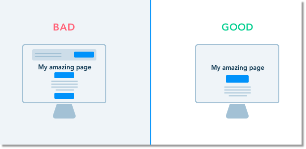
For UX/UI design, you not only need to consider how your CTAs are designed, but also how they’re distributed throughout your website. Avoid excessive use of CTAs, and if you really need to include more than one on a page, use different colors to clearly delineate between the two.
6. Responsive Design
Chances are, you’re reading this blog on a mobile device—and we have the numbers to prove it. Since October 2016, mobile and tablet traffic has officially drowned out desktop. Today, roughly 57% of web traffic is mobile.
When it comes to UX/UI design, responsive design is non-negotiable. (Side note: If you haven’t optimized for mobile download speed, here’s how to AMP up your web pages…pun intended.)
Responsive design ensures that your website works seamlessly across every device. To maximize both your user experience and user interface, you need to design with mobile in mind.
Mobile users have a very different experience from desktop users. Being able to hide or stack information is a must for UX/UI design, and when you’re laying out your wireframe, remember that people are swiping—not clicking. Avoid putting hyperlinks that are smaller or larger than the size of a finger tip.
✅ Bonus Tip: Start small, then scale up—it’s much easier to add information to the desktop version.
Conclusion
Now that you’ve learned how to put yourself in your users’ shoes, hopefully you’ve seen things from their perspective. When it comes to UX/UI design, it’s important to remember that you’re designing your website for them—not for yourself.
Combine your newfound UX/UI knowledge with Part 1 of the Ultimate Web Design Series and you’re halfway toward a more effective website.
Stay tuned for Part 3: Content, coming soon! Be sure to subscribe to Level Up so you don’t miss a moment of marketing mastery.
{{cta(‘6bbec13e-2b0e-45d8-9208-84f8d46eac5e’,’justifycenter’)}}